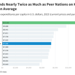
This updated chart collection compares indicators of health care utilization and prices in the United States and 11 similarly wealthy countries to investigate whether higher prices or higher utilization of healthcare services drives the high healthcare expenditures in the U.S. relative to peer nations.
How healthcare prices and utilization in the United States compare to peer nations?


